“One option is not really an option”
Customers click and buy more when there’s a link accompanying your big ‘buy now’ button (CTA). I personally call this persuasion technique the “Hobson+1 Effect” and it applies for most (but not all) of your visitors.
At Online Dialogue we’ve ran lots of A/B tests proving this persuasion technique (see some examples below): We simply add a second link very near to the ‘big button’ on a page. Links like ‘more information’, ‘add to whishlist’, ‘direct checkout’, ‘tweet this’ or simply ‘print this page’. They all tend to increase sales (conversion)…
Hereby a psychological explanation of the effect as well as 3 conversion tips and a few A/B-test cases. Enjoy!
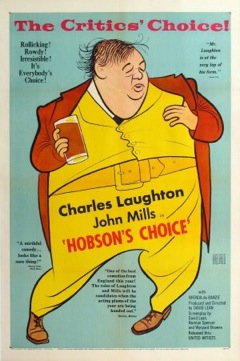
 Hobson’s choice
You’re probably familiar with the Paradox of Choice (if not check Barry Schwartz TED-talk); “The more options to choose from, the less people make a choice” (and it leads to unhappier people…).
=> This paradox does however not apply at the lower side of its scale: 0, 1 and 2 options…
A Hobson’s choice is a choice with one option that you can choose to take, or not. So if you offer a customer a product, he has a Hobson’s choice; “buy the product, or don’t buy it”. Unfortunately for you, most online customers don’t buy. The Hobson+1 effect is one way to counter this habit of ‘unconverting customers’.
Explanation of the Hobson’s+1 Choice Technique
Explanation 1: Ego depletion
One explanation is in terms of ‘depleting mental energy’; When you offer a Hobson’s choice like ‘buy product X’, a brain will use it’s mental energy to choose between the options of a) buying the product and b) not buying it. But when you offer a Hobson’s + 1 choice like ‘buy product X – or – tweet this’, a brain will use it’s scarce mental energy for a) buying the product, b) tweeting about it, and… c) not doing anything at all. By the time the 3rd option is dealt with, the brain’s mental energy is more depleted than in the Hobson’s ‘buy or don’t’ case. Therefore chances rise that the brain will go for buying the product (since tweeting is probably not really an option).
Explanation 2: Net emotions
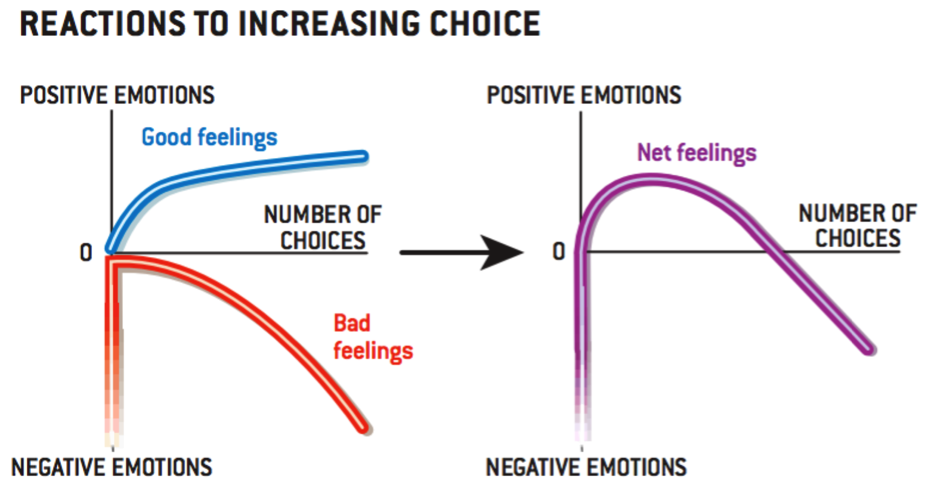
Another scientifically interesting explanation comes (duh ;-) in terms of ‘positive, negative and net emotions’. Our Paradox-of-Choice-guru Barry Schwartz uses a clarifying equation and graph for this:
“Positive emotions – Negative emotions = Net emotions”.
In short it comes down to: More choices give us positive emotions, for example due to feelings of autonomy and the affective forecasting error. But more choices also give more negative emotions since we – for example – miss out on more and more options (‘opportunity costs’) and chances of regret.
Therefore the “net emotions” rise from 0 to 2 options, but fall with too many options (the inverted ‘U’ shape from the image above).
- 0-options choice:
This feels really bad. Being offered no choice provides no positive emotions, and almost infinitely large negative emotions (we hate having no choice). - 1-option (Hobson’s) choice
This feels overall a lot better since there are no negative emotions due to ‘missed opportunities’. On the other hand, there are not really a lot of positive emotions either, since 1 choice provides no feelings of autonomy or richness. - 2-options (Hobson’s+1) choice
Now we’re getting somewhere. We can make an autonomous choice (positive), and we miss out on just one option. Overall this feels good. - Too much choice
When we keep adding choices though, we end up unhappy again. Because although we are more and more autonomous in our choice (=positive), we also miss out on more and more options., which evokes negative emotions. Therefore the net emotions are getting negative.
BTW: Closely related to the one-choice paradox is the quite well known decoy effect (or ‘ugly brother-effect’ as guru Dan Ariely calls it). They are however not the same. Where the Hobson’s+1 effect is the positive effect of adding “a second option”, the decoy effect is about creating “an ugly option”. The latter can be done by adding an ugly option to the existing option(s), or by altering one the existing options (making the preferred option or options look better).
Online Persuasion tips:
When you want to deplete your customers consciousness:
[checklist]
- Always offer a second option to choose from (especially with CTA’s!),
- Preferably you let both options lead to the same choice (trivial choice)
- But… do not offer the alternative second option when a customer is ‘goal-directed’ (ie return visitors?), as there might be a counter-effect: distraction of his conscious ‘system 2’ behaviour!
[/checklist]
Online A/B-test cases:
Metro.pl
One of my clients (Metro / Makro) had one Call-To-Action on their productpages (Do koszyka = Add to cart). They tested adding a second link (Zostań klientem = Become a client). This resulted in 5% more add to carts and 8% more people actually checking their cart.
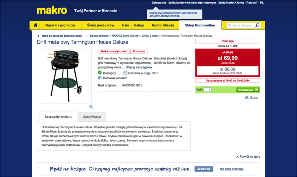
Polish webshop of retailer Metro-Makro: Makro.pl
Essent.be
I really like an A/B-test we did for Energy provider Essent (in Belgium). We added social sharing options beside their Call-to-Action: Save Now (bespaar nu). This highly increased sales for new visitors. Interestingly though it decreased sales for returning visitors… My hypothesis here is that returning visitors are more goal-directed and more goal / conscious / top-down / system 2 –directed in their behavior. And than the distracting social sharing buttons work counter-effective…
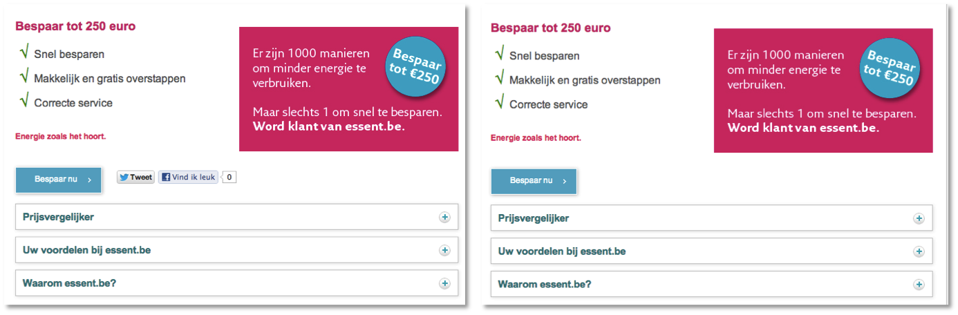
Belgium energy provider: Essent.be
Conrad.nl
Finally E-tailer Conrad also did a really cool ‘one-choice paradox’ test (during our “Master of Online Persuasion” course). Beside their Call-To-Action ‘Order Now’ (Nu bestellen) was a list of 5 possible other actions. All they did was pick the ‘Add to Whishlist’ (op de verlanglijst) from this list and place it just below the big CTA. Guess which variation sold 16% more…
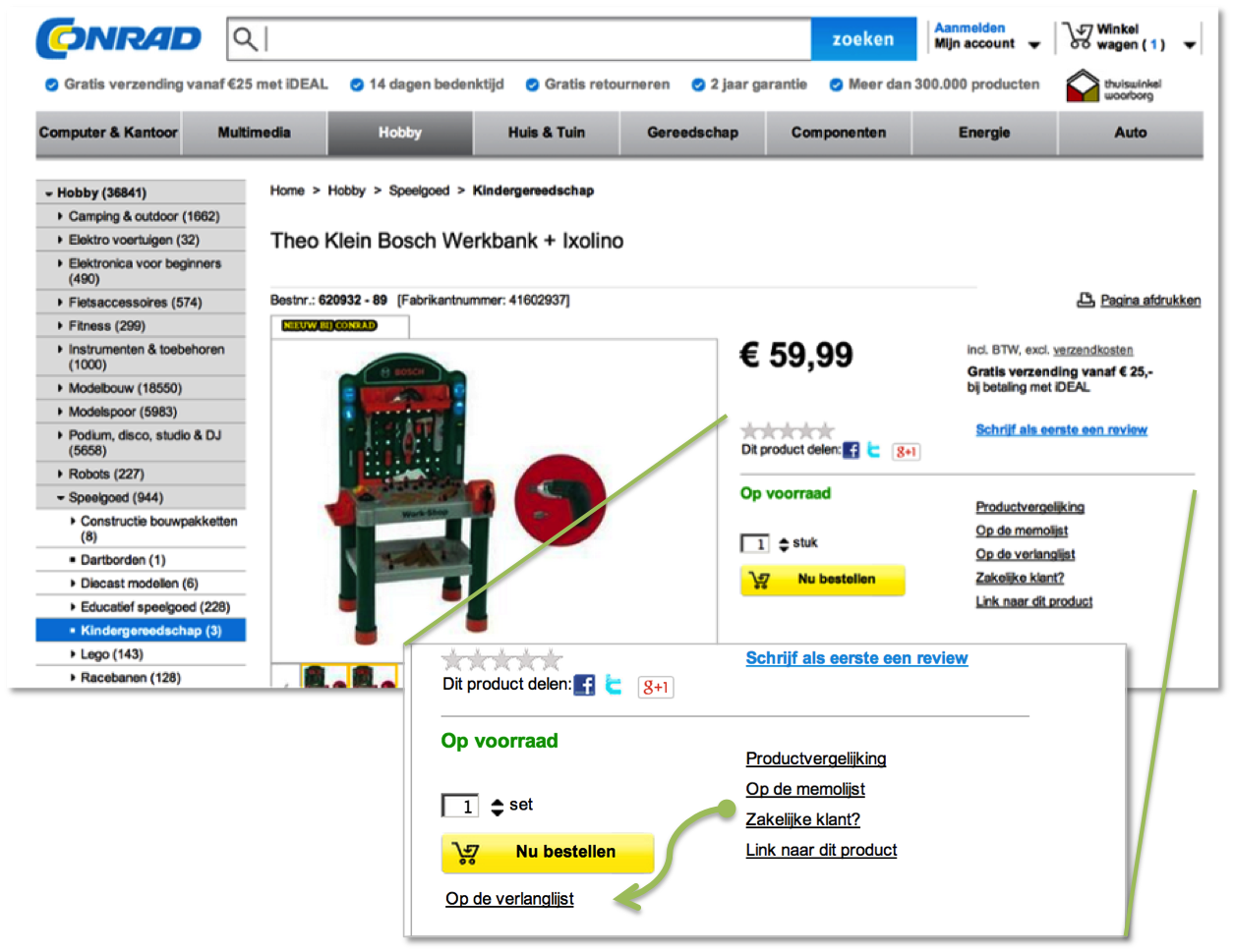
Dutch webshop of retailer: Conrad.nl
Read more:
Barry Schwartz (2004), “The Tyranny of Choice”, in Scientific American (april 2004), pp. 71-75.